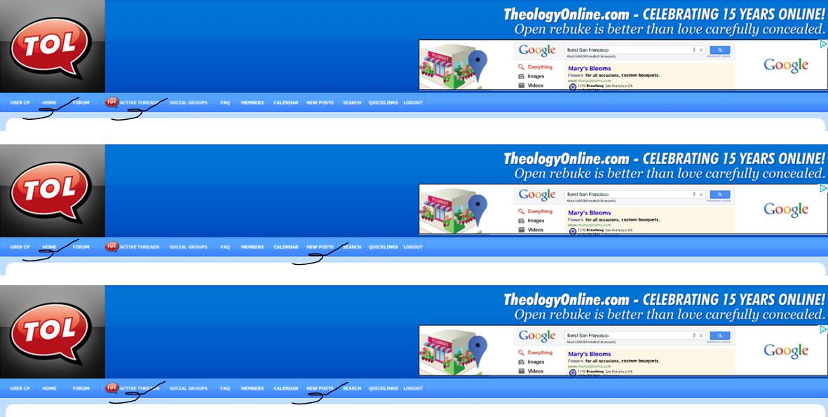
TOL Home Page Redesigned and optimized
I don't like it. There should be no
home page and active threads page. The home page should automatically
include the active threads.
Response to comment [from a Christian]: "The
home page does include the active threads, however, it only includes a
section of them, just as it includes a section of the other sub forums.
If you click on any of the headers you will be taken to the full page of
said sub forum."
It’s redundant. If you select New Posts or Active threads, you pretty much get the same thing. The new home page is similar only it divides sections by religion or politics.
"Whine, whine, whine...You just want to complain about something, don't you?"
You have: active, religious,
political, and other section on the new home page. Then you have active
tab and new post tab. All that is needed is a home page and new post
tab.
Redesigned, yes. Optimized, no.

You like seeing the same thread located in four different places?

“It's lewd, lascivious, salacious, outrageous!” ~ Jackie Chiles
Response to comment [from a Christian]: "The home
page is really geared toward new users who have never been to TOL
before. Most regulars will go straight to the forums or the active
threads page.
There is a little bit of redundancy, and at first I removed the active
threads that were in politics and religion to avoid that duplication but
I was afraid that people wouldn't think those threads were active which
was misleading."
Then I would remove either the ‘active’ or the ‘new posts’ tab (preferably ‘active’).
"Are you talking about the button in the menu bar?"
Yes. The buttons on the menu bar. 'Active' should be removed and the red icon should be moved to 'new posts'.
"Those are two different things.
Active threads displays the threads that are the most recent to be
posted in.
New posts displays only posts that have been posted in since your last
visit. Here is something cool you can do with "New posts", go to the
quicklinks menu and select "mark all forums read", you will then notice
there are NO new posts in the New Posts menu, (it's like a fresh start).
Then only threads that get new posts since your last visit will show up
in the New Posts menu.
Conversely....
Active threads ignores all that and just shows the threads in the
order of what has been most recently updated.
Both options are valuable and both options are necessary.
Oh... and we didn't change those, they have always been that way."
Would any of these options remove a viewing
option?

"As I just explained..... yes, removing any of those buttons would remove a unique feature on TOL."
In other forums on the menu there are viewing option buttons like: recently updated, most replies, or most viewed, or custom settings. You want to keep the unique viewing options that are generated by selecting 'active threads' and 'new posts'. Ok.
I think the red TOL icon to the left of 'active threads' should go because the viewing option is no better or worse than selecting the 'new post' option.
"We keep the red "TOL" on the active threads page because we feel that's
where the action really is."
Maybe you're right. You should do a poll. Do you select the
'active threads' button more than 'new posts' button?
"Thanks for your feedback."
You're welcome.
